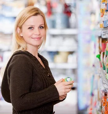
Most people know what it's like to go shopping for a particular item, and end up with several items in addition, or perhaps another item in place of what they went for. So what exactly is it that prompts us to purchase a different item, or additional items? It is not likely need, it’s very likely that the product caught our eye, and the coloring of the package may have been behind that. In the concept of packaging design, the correct color is imperative.
When a consumer is shopping in San Diego, California for instance, and they walk into a market to purchase a 12 pack of fruit flavored water, what is going to have input on their decision of which brand to select? Considering they are shopping in California it is assumed they are not going to relate to gloomy winter weather, but rather sunshine, beaches, and the ocean. The coloring of the packaging design should reflect sun, beaches, warmth. Bright orange, yellow, sun-drenched pink, with hints of ocean blue waters will all be natural demographic coloring, as the sun is bright, or sets on the horizon with shades of yellows, and orange with a pink hue in the background. This packaging design says San Diego, while dark blue, maroon, brown, and gray says Minneapolis.
The cosmetic industry is huge, and there is extreme competition among drugstore brands of cosmetics and skin care products. Generally, they are all priced within a similar range, so what will make a consumer select one product over another? This is when a design company, such as Lien Design can guide the shopper to a particular product. In most instances cosmetics will be purchased by consumers that appreciate purple and pink shades. A packaging design that feature pale shades of lavender, with contrasting bright purple design, will catch the eye of an alert shopper. They look at the beautiful colors that appeal to them first. They may continue on to compare, products, however that first product that caught their eye because of the color is most likely to be the one they end up selecting. Thus, the packaging design sold this particular product.
Color attracts the human eye, even at a very young age. Take two pictures of the exact same item, have one colored gray, beige, maroon, and pale green. Color the second with hot pink, bright red, and vivid green. Now, put these two designs in front of a 7 month old infant, and note which one they stare at. No question about it, their eyes will be drawn to the brightly colored picture.
This is not to say that the less bright and flashy colors do not have their place in packaging design, because they do. It just depends on what is being packaged within them. A professional company such as Lien Design has the expertise to study demographics, current trends, and the local market. They can then create a packaging design to represent San Diego, California, or Fargo, North Dakota, whatever the need may be.
The supermarket aisles are filled with product after product. A box of rice would appear out of place, or child-like if it was designed with the colors of the rainbow. However the rice does not need to have a boring packaging design, it could display a mixture of subdued colors with a contrasting vivid color, such as red. A packaging design such as this speaks to the consumer by having the red say, “look at me”, a beige color saying “I am a sophisticated shopper, I know what I want”, a winning combination to get that box of rice sold.
Packaging design is representation of the product inside, however it also represents the consumer, and must appeal to them. In a case that the appeal factor is missing, the product tends to be overlooked completely, and the shopper will reach for an attractive packaging design.
There is no doubt about the importance of the package, the design, the “wow factor”, the call-out to the consumer. Few people grasp the complexity in designing packages, which is why in many cases, it is advisable to use a design firm such as Lien Design, in San Diego, California. Package design is what they do. Developing a product is only a portion of the work, the package design is the first impression of the product, it may be what prompts shoppers to select that particular item, perfect package design leads to perfect sales.
Written with ©2017 Lien Design


