Imagine yourself on your first day in college. You walk past different people, and you notice their different clothes, hairstyles, manner of speaking, and immediately—albeit unintentionally—you start classifying them into personalities: cool, hipster, geek, trying-hard, old-fashioned, snobbish, professional, and approachable, are only some of the descriptions that come to mind. Based on these, you begin deciding who you want to be friends with.
This is pretty much how packaging works. When presented with a lot of choices in a grocery store aisle, chances are, you would notice and probably pick up the product with the most interesting and creative packaging design.
It takes a lot of imagination and risk to successfully improve the packaging of your product. Fortunately, design experts have identified emerging trends to turn your brand’s image from old and unremarkable to an award winning package design. Here are seven packaging design trends for 2015:
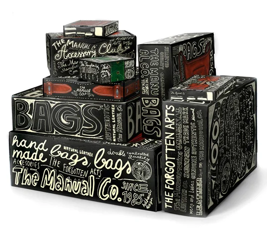
1. Hand drawn labels and logos
Hand drawn elements spell chill and approachable. This kind of packaging provides a personal touch to the product, making it more friendly and casual to the eyes of customers. It also has a DIY feel that gives the idea that there is actually a person behind the brand. Handwritten elements may look imperfect and playful, but this is exactly what adds to the charm of the product.
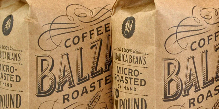
2. Kraft paper
You can never go wrong with Kraft paper. It has been an increasingly popular packaging material since 2013, due to its practicality. Kraft paper is a sustainable material with high elasticity and high tear resistance, and also gives a lot of freedom to designers to explore their creativity. It also appeals to consumers because it is environment-friendly.
3. Hyper-functionality
The right mix of aesthetic appeal and after-market usefulness can go a long way. Packaging need not only be pretty, but it can also be functional even after you’ve used up the product it used to hold.
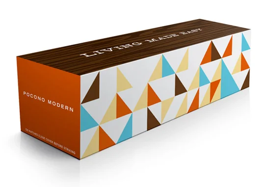
4. Bold shapes and colors
The use of solid shapes and bright colors can instantly catch the attention of consumers. Aside from giving of a feel-good vibe because of its colors, this design immediately makes your product stand out from other items beside it in a grocery aisle.
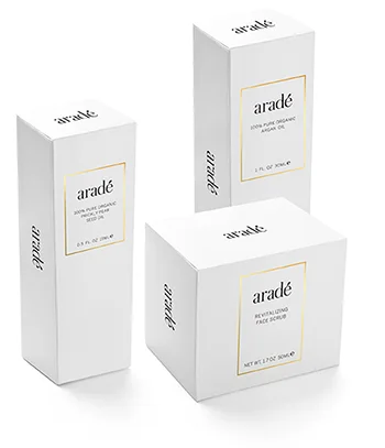
5. Minimalist/ Pure White
If you want to give your product a professional feel without using loud colors and shapes, going minimalist might work for you. Using mostly white in packaging the item makes important elements such as the product name and logo stand out. It also gives an image of honesty and purity to the brand.
6. Clear packaging
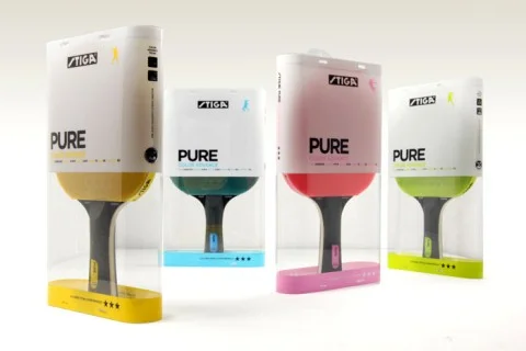
You may also opt to let the product speak for itself by using transparent packaging and only using white text over it. This design is straightforward and gives a sense of confidence in what the product can actually do for the consumer.
7. Going digital
In the age of new technology, going digital is definitely in. Using QR (Quick Response) codes in your packaging to lead the consumers to your brand’s online channel helps in reaching tech-savvy audiences. Going online also helps in further advertising your product in the web.
Whatever design you use in rebranding your product, the important thing to consider is whether this would properly embody the established image of your product. Packaging, after all, is your product’s personality, and just like what we always tell people: stay true to yourself.


