Written by ©2018 Lien Design (edited for 2025)
In the world of product design, packaging is an essential consideration when it comes to influencing consumer opinion. Frequently, initial impressions come from packaging rather than the content within. The design process for black and white packaging must consider how a product looks in a store environment, including the contrast of colors and the impact of lighting. Black and all white packaging are some of the most striking color schemes when one wants to make a statement. But who has the better black or white monochrome packaging? In this section, we shall compare black and white packaging that will help you understand which shadow will match your brand story more appropriately.
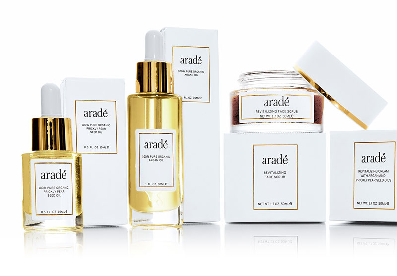
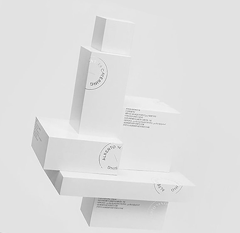
White: Pure And Simple
White represents purity, cleanliness and modernity. Like a blank page for people to project their thoughts and imaginations onto an object.
When thinking of packaging design, the colors you chose for your packaging can be very important. Current trends are showing single colors that create a visual architectural block, help these products to stand out from the competition. White packaging design has been popular in the past, lending a sense of purity to the product while giving off a distinct modern appeal and a clear, uncomplicated overall vibe allowing customers to digest the message of the product. Other tones that are popularly used include creams, blues and black. This article will look more closely at this solid color design for packaging paying particular attention to black packaging design.
When we look at a wall of products at the grocery or drug store, white can really pop giving the product a natural appeal. However, because it is used so commonly, it may be starting to lose its appeal, making black a more popular choice.
Pros:
Versatility: White can be used with any accent; hence brands can be changed according to trends or needs of clients. Think about bright reds for winter seasons or summery blues popping against the clean background.
Hygiene: White packages can look pure and clean which might convince buyers to get them as they associate them with sanitary conditions.
Minimalism: The customers' attention in our fast-paced world is drawn towards clutter-free designs. This kind of style of packaging is a symbol of minimalist chicness that appeals to contemporary tastes.
Luxury: When it comes to features along with quality materials and sleek finishes, white packages could bring up perceptions on premium products and enter luxury market.
Cons:
Lack of differentiation: Your product may fall short from all other white products in an ocean of similar ones. This is why strong branding and uniqueness created through texture are important to avoiding being lost in a crowd.
Susceptibility to dirt marks: Because white surfaces easily show fingerprints smudges need extra vigilance in handling, storage and production.
Limited emotional connection: However versatile it is, at times white feels sterile devoid of emotions. Thus think about warmth inclusion through imagery or subtle texture that bridges this gap.
Black Packaging Design: Sophistication And Intrigue
Black represents sophistication, mystery and exclusivity when used in packaging. It's an audacious selection that quickly catches people's attention and entices them to explore.
Black has often been used to advertise luxury items like ice cream, chocolate, wine and spirits. It is rarely used on snack items. It can be fresh and sexy. It contrasts well against white and other light colors and looks great on screen, and in presentation design and print outs.
However, before these factors cause your design team to fall in love with black packaging design, they must be aware that the way the product looks on paper or in mockups does not always communicate well as compared to the way it looks on the shelf at a store. This is due to the fact that, despite the overhead fluorescent lighting and overall appearance of a brightly lit store, a lot of supermarket and retail locations are surprisingly dark.
The overhead lighting can serve to cast shadows on the products and they can be further obscured if the shelves themselves are black. While the first few products on the shelves may have adequate lighting, once these are removed, the ones located further back will not look as attractive.
Of course, this doesn't mean that black can not be used on packaging at all. When planning your modern package design, it is important to consider the environment it will be in. If your product is going to be in a location next to other items that tend to have brightly colored packaging, your black packaging will stand out.
Pros:
Premium appeal: Association of black with luxury and high-end products may result in higher perceived value and its ability to attract premium customers.
Drama And Intrigue: This color creates an enigma that forces people to wonder what could be inside.
Versatility (with limitations): Although not as flexible as white, black combines well with metallic touches, bright splashes of color, and bold fonts to produce outstanding visual contrasts.
Timelessness: Black never goes out of style hence a safe option for brands looking for classical and long lasting aesthetics.
Cons:
Can appear heavy or oppressive: Depending on the product or context, black packaging may be too dark or even scary. It is necessary to balance it with lighter elements.
Limited visibility in store shelves: In stores brightly lit aisles, black packaging may recede into the background making it harder for the products to stand out.
Not ideal for all products: Black might not be the best choice for products associated with freshness, naturalness, beauty, or lightheartedness. Think about the message you want to convey through your product and who will buy it before going ahead with black as your brand color for instance.
The Verdict: Balancing Act
Truly speaking, whether a producer chooses black or black and white packaging is dependent on the kind of target market he is trying reach his goods out for.
If you seek clean, modern and versatile looks for your company go white. Think Apple, Aesop, Muji etc.
On the other hand if you are more into sophistication luxury exclusivity and elegance then consider black as your next move. Think Chanel, Tom Ford Dyson etc.
Let us not forget that black and white packaging have their own pros and cons. The secret is to know what your brand stands for and who you are targeting as an audience then be free to use the color you chose to tell your story to the people you want.
Remember, both black and white packaging offer unique advantages and disadvantages. The key is to understand your project or brand's core values and target audience, and then leverage the chosen color to effectively communicate your story and resonate with your ideal customers.
Bonus Tip: Don't be afraid to experiment with textures, finishes, and pops of color to add depth and personality to your monochromatic packaging. A touch of gold foil on black or a subtle embossing on white can elevate the design and make your product or label truly stand out.
Don't worry about trying these tricks for adding dimension and character into a one-colored package design. Add a touch of gold foil on black or consider a light embossing treatment on white; such tiny details will give more prominence to it leading in something quite unique.
By considering their advantages and disadvantages carefully, you can choose the perfect shade that will paint an attractive image of your product hence attracting the right consumers. So now tell me about your colors.
Design and creative teams should also consider adding something to the structural packaging design that makes it unique, memorable and recognizable, to help the product stand out.
In general, consider the color of the location where your product will be sold. Creating packaging that matches the environment it will be in will cause the features on the pack and label, like the text and images, to stand out.
Whether you are thinking of creating a solid color background for your design for packaging or going for another unique packaging design, Lien Design can help. This San Diego branding and graphic design firm has been helping companies create design for packaging for years, making for products that really stand out on the grocery store shelves. If you want your product to be the one customers see first, contact Lien Design to see what they can do for you.
©2025 Lien Design. All designs and trademarks are the property of their respective companies and are being shown for educational purposes only.
Frequently Asked Question for Black and White Packaging Design:
What does black packaging mean?
Generally, black is used for high-end products, and the colour conveys a sense of luxury. It evokes class and elegance. Like white or grey, black can also be accentuated with other colours. Metalized gold or silver printing on matte black packaging creates an expensive look.
What is the color theory of packaging?
Packaging colour psychology uses different hues to influence your target consumers' behaviour. The use of different colours can invoke specific emotions. For example, red communicates excitement, passion, and youthful zeal, whereas blue signifies dependability, calm and trust.
How to create your black and white packaging design?
You're going to need incredibly high quality black and white packaging. Find a designer who can create your vision, or run a design competition to see design inspiration in other countries. Start a competition Designers from all countries give you suggestions for the contests. You provide feedback and pick the best one. Get started on projects: Find your ideal designer to match the budget. Afterwards, we will be working individually to create the custom packaging.


