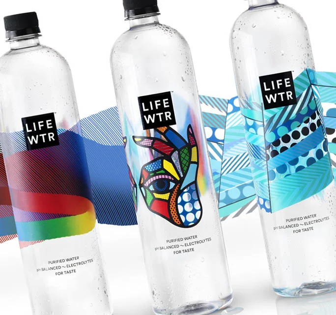
Trends in packaging label design are constantly changing and updating with the times. It is important to stay on top of these trends while including classic elements ensuring your packaging will endure the test of time. Keeping that in mind, here are some great tips for designing packaging and labels.
Origami Designs:
These folded designs can transform your packaging into a work of art. Many are thoughtfully laid out though simple at their core. To the consumer, these designs can present a quirky image making the product relatable, refreshing, uncomplicated and causing it to stand out on supermarket shelves.
Easy Labels:
Also giving off a refreshing and uncomplicated vibe, these labels can be attached to bottles or loosely wrapped around items. They give off a charming home made vibe making them great for independent shops and small businesses who need to product packaging quickly and cheaply. They are also easy to edit, making them useful for a variety of products.
Typography:
The typography you use can really help convey the message your product is looking to send. A classic serif can be great for an aspirational product while a pared-back sans serif can work for a product that is cool and trendy. For a luxury product, go for traditional serif typefaces or heavily tracked headers. Some of the best food & beverage branding agencies employ designers that have exemplary skills in typography and hand-lettering. Check this out, DesignRush highlights the top food and beverage Agencies.
Natural Color Palettes:
While it was once thought that bold brash packaging would serve to make your product stand out, today the trend is towards toning it down. Nature inspired colors send a message that your product is eco-friendly and ethically sound. They also have a soothing effect on consumers.
Photography and Minimal Styles:
While illustrated graphics and simple typographic designs seem to be trending as opposed to photography, photography can still be incorporated into certain label designs. Black and white photography can work well when paired with colorful typography. Monochromatic color photography can go well with simple, sans serif type in a matching color.
Incorporate Art:
Arty looks will always stand out on a supermarket shelf. If you’re not handy with a paintbrush, and don’t have the funds to hire a professional, digital and vector art can also be the way to go.
Masculine vs. Feminine:
While there is no clear design trend in marketing products for the sexes, black and white often makes fitting packaging for men. These work well with square sans-serif type. Incorporating patterned designs, on the other hand, is a great way to market to women adding a touch of beauty and femininity.
If you are looking to create packaging label design for your products, these are all suggestions you should be keeping in mind. It is also a good idea to consult a professional on all aspects of your packaging including logo and label design and graphic design labels. If you are trying to find a company to help you in these aspects of your packaging, consult San Diego, California branding and graphic design experts Lien Design. They are always on top of the latest trends making for products that are sure to get noticed increasing your bottom line.
Disclaimer: Photos and trademarks are property of their respective companies. Some of the above photos are being used for educational purposes only and are not owned by Lien Design.


