Written by Lien Design ©2018
When we think of packaging designs, there are a few that stand out as iconic. Each of these designs has a story behind them and it could be fun to hear those stories. Read on to find out what lead to the creation of some of the best packaging designs in history.
Bear Shaped Honey Bottles:
These are so common these days that many take them for granted. The first company to actually use the design was Dutch Gold Honey Inc. The idea came to founders Ralph and Luella Gamber when they were at dinner with friends in 1957, shortly after the death of Winnie the Pooh creator, A.A. Milne. The bottle shape was inspired by Pooh, quite simply, a bear that likes honey. Because the founders were not familiar with patenting and franchise rights, the image is pretty much up for grabs which is why it is used so often.
Toblerone’s Triangular Design:
There is some argument over the source of owner Theodore Tobler’s inspiration in making his chocolate bars triangular. Some claim he was inspired by the Matterhorn Swiss Mountain. Others say it was a cabaret show where the dancers formed a human pyramid. The bars are delicious, whatever the truth may be!
Morton’s Salt Pour Spouts and Containers:
Today, we always think of salt as being sold in a round container with a folding, pouring spout. However, that wasn’t always the case.
Times were when salt would clump due to humidity making it difficult to pour. To prevent this, Morton created a humidity safe container with a pouring spout that would allow the salt to pour easily making for the innovative packaging design we know today. The girl pictured on the label with the umbrella was meant to signify that the product was safe from moisture.
Campbell’s Soup Cans:
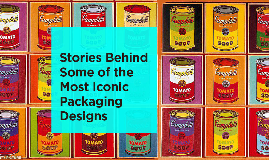
So often seen and also made iconic in the famous Warhol painting, it’s hard to imagine Campbell’s soup cans in colors other than the traditional red and white. However, these labels were originally blue when they launched in 1897. The following year, the company’s treasurer attended a football college game and was so inspired by one of the team’s red and white uniforms, he proposed changing the Campbell’s soup packaging to match.
The innovation utilized when creating and updating these packages can be inspirational for those working on packaging designs for their brands. However, to be sure you are doing all you can to create the best design for your product, it’s a good idea to consult an expert.
San Diego, California graphic design and branding company Lien Design can help you make the most out of your packaging design. They can create innovative packages that can help your products to stand out on grocery store shelves. Consult Lien Design for packaging that is worthy of being included among the most innovative in history.


