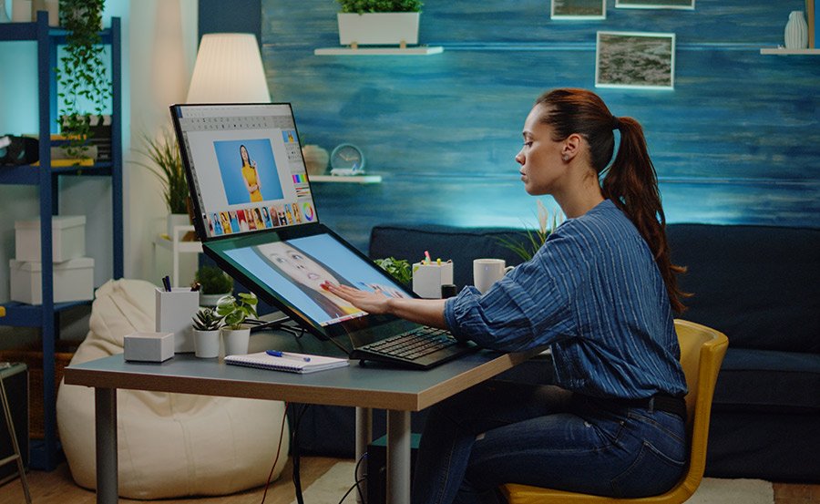
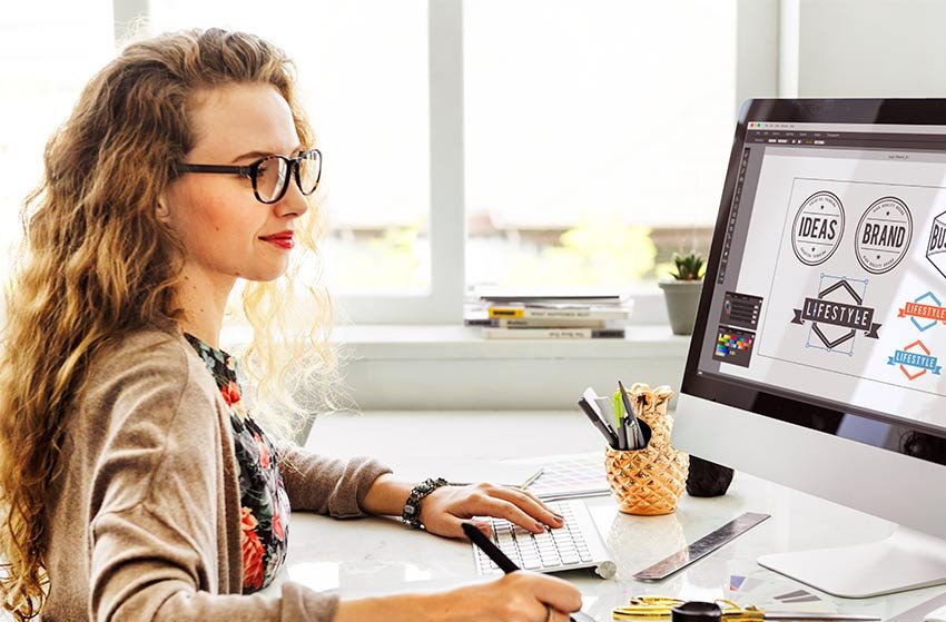
Graphic design is one of the most important aspects of marketing. Whether you are designing a logo, brochure, or banner ad, it's crucial to make sure your graphic design looks great. There are many ways to design a graphic, but the more you know about the right techniques, the better your final product will be. It takes a lot of time, patience, and talent to create something that will stand the test of time. So, how does your graphic design look? Is it the stellar piece of art you created, or is it a mishmash of colors and shapes that looks like a 4-year old made it? If you're looking to improve your design skills, then this blog post is for you! Here are 8 hacks that will help make your design look amazing.
1. Choose consistent elements to enhance your branding
If you want your brand to stand out, make sure the logo and colors you use are always congruent with each other. Inconsistent colors or logos will just cause confusion for viewers and may not portray the message that was intended by your company. For example, if you saw a logo that was done in black and white, but the text of the logo had red letters, chances are you wouldn't know what type of company it is. You would be confused as to whether or not they sell expensive items because their color scheme portrays luxury items (black), but then they use cheap colored lettering for their "text" (red). So, how do you fix this problem? First of all, improve your business logo characteristics by reviewing design elements. You can make sure the text color matches your logo with such a tool. You can't have one font that is black and another red without confusing people about what kind of company you are! Second, always use a consistent color scheme for each design.
2. Pair contrasting fonts to make your design look interesting
Contrasting fonts is one of the most important tricks to know when it comes to graphic design and something that many designers don't even think about. You can pair any fonts together (serif and sans serif; handwritten and regular typeface), but you need to use them with purpose in order to make your design look amazing.
3. Use grids for your images and layout
Using grids for images and layouts is a great way to make your design look extremely organized. If you don't use a grid, the chances are that your design will be very chaotic with no real sense of order or direction. It's important to have a structure in everything you do (including graphic designs), and using grids provides this structure and makes designs look more professional.
4. Match colors within your design
Matching colors is very important when it comes to amazing graphic design. You want your design to stand out, but you don't want too many contrasting or clashing colors that take away from the overall look of the piece. For example, if you have a photo with bright reds and oranges in it, then choose an orange/red color to match it and use that as your color scheme. When choosing colors, make sure they don't clash with one another or the photo you're using in your design!
5. Add transparent icons for a modern look
For a more cutting-edge design, try using transparent icons that blend into your layout and photo in the background. This is perfect for flat designs where you have many layers of images and text on top of each other because it makes everything feel like one cohesive piece!
6. Fix color issues in your images before you upload them
If your image has bad lighting or if it's too dark, don't just edit the graphic design in Photoshop and think that everything will be fixed! You need to fix these issues before uploading because this is what makes your images look professional (or unprofessional). If there are shadows on people's faces, make sure you remove them because this can be distracting for viewers. You want your images to look like they came out of a magazine, so fix all the little details before uploading!
7. Illustrate information with infographics
Infographics are a great and subtle way to convey information. They not only look fantastic but also convey information in a more visually appealing way. You can use them for blog posts, articles, or just to show off some interesting numbers and facts about your company that may stand out from the rest! You can use any type of infographic, from charts to diagrams, to make your information stand out.
8. Choose consistent design elements to improve branding
When you create a new design, be sure to choose consistent elements like fonts, lines, symbols, and color schemes. These designs can be for your blog posts or marketing materials. If you don't use consistent design styles, then it will look very unprofessional, and people may not take your brand seriously!
Conclusion
As you can see, there are many tricks that graphic designers use to make their designs look amazing. These tips apply to anything from blog posts to web design, social media posts, and landing pages all the way up to printed materials like business cards!
Writer Bio
Chris Walker is a freelance ghost writer who works with small business brands by providing them quality articles and blog posts.
All designs and trademarks are the property of their respective companies and are being shown for educational purposes only.


