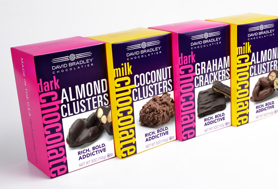
Imagine being in a supermarket store with an unlimited number of chocolates in front of you. Rows of multicolored covers are there to draw attention towards themselves, suggesting some forbidden pleasure. However, it is difficult to choose from so many possibilities. It’s actually the silent language used by chocolate brands to seduce you (and your purse) – design.
In the world of chocolate business, good brand and packaging design is not only beautiful; it’s also an important tool for salesmanship. This is why:
First Impressions Count: In this era where impulse buying has become a norm, a chocolate bar has a fraction of seconds to catch your eye. Strong colors, captivating visuals and unique designs can distinguish your brand from others attracting you towards picking it up for closer examination.
The Wrapper: Packaging serves as more than just a container; it acts as the fabric upon which your story unfolds. Through colours, picture representation and typography designers will share what type of chocolate yours is – opulent? Fun loving? Fair trade and ethically sourced? This visual story line assists you in reaching out to individuals who resonate with your values and have similar tastes.
Earning Trustworthiness and Worthiness: By making specific design decisions about your product’s quality targeted at consumers’ minds, one can indirectly change their perception about this issue too. High end materials
Ah, chocolate, it’s one of the most decadent treats. When thinking of creating dessert packaging design for these rich bars of goodness, you need to come up with something that is going to make the candy seem irresistible. You can also have some fun letting your creativity run wild.
There are many different strategies that are used in designing chocolate bar packaging. Here are some we recommend.
Minimalism
Minimalism is big in snack package design and when used for chocolate bar wrapping, it can give a refined sense of purity and luxury.
But of course, chocolate bars should be anything but boring. If you want to take your design to the next level, add colorful elements to a minimalist look. For example, let a brightly colored foil wrap peak from behind an austere white wrapper. The color can vary depending on the flavor of the bar.
Then provide a logo matching the foil color of your choice.
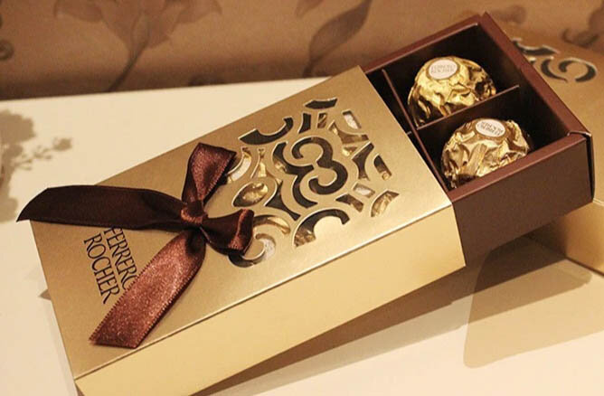
Metallic Gold
An embossed metallic gold emblem always adds a sense of luxury to your products and it is especially effective when used on chocolate bar packaging.
Metallic gold works well with an otherwise minimalist contemporary packaging design that uses streamlined shapes, simple text and a splash of color.
Retro Packaging
Retro is another packaging design trend that is being embraced by more companies and candy manufacturers are no exception. When used on a chocolate bar, it takes consumers back to a simple time when candy was a treat and customers got more for their money when making a purchase.
The style of your packaging will change depending on the era you choose. If you are going for a 1960’s style, bright colors and geometric shapes will work well. If you are aiming for the 1920’s, think of a more elegant style with art deco elements.
Organic
These days everyone is trying to eat healthier and incorporating organics into your diet is the way to go.
For true chocolate lovers, check out these 25 Yummy Chocolate Statistics & Facts for a Sweet 2020.
Chocolate manufacturers can capitalize on the organic trend by using packaging that conveys rawness and honesty.
Using corrugated card as the main packaging material is a good way to start. Add modern elements that take the packaging to another level giving it a hip and modern vibe.
If you are looking for a design for your chocolate bar, the sky is the limit. In fact, your options are so varied, it may be difficult to decide on a design that is best for you. But the right design team can help.
A good design team will work with your brand to find out what you’re really about and convey that through your packaging design. They will make sure your products have every advantage when it comes to standing out on supermarket shelves.
If you are looking for a package design team in the San Diego area, Lien Design is highly recommended. They will provide great looking packaging that represents your brand perfectly. Turn to them for the packaging design you need to raise brand awareness and boost conversions for your chocolate candy products.
We wish you the best of luck in boosting your company’s growth!
All designs and trademarks are the property of their respective companies and are being shown for educational purposes only.


