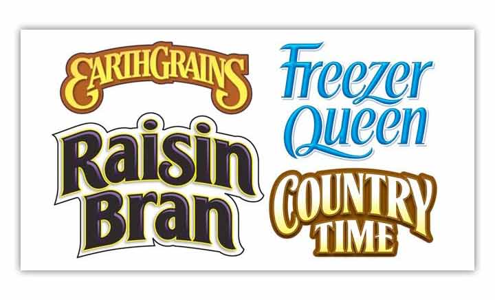
Written by Lien Design ©2017
When you are creating your brand, every detail is crucial. From your web design to your business cards, from label design to the way you answer the phone…everything your company does will reflect the image of your brand and can have a positive or negative impact on how it is perceived by consumers. Custom typography is one of these details, and whether it’s being used on a label, in a print ad or on a web site, you need to understand what will work best in promoting your brand. San Diego’s premier graphic design and branding company, Lien Design, can help your company represent itself in its best light, no matter what aspect of marketing you are dealing with. Here are some tips business owners should be aware of when it comes to the typography they are utilizing.
Readability:
When you are creating an ad or web design for your company, the most important thing is that the print should be legible. Many companies focus on using something that is creative or aesthetically pleasing and, while this is not the worst idea, if it becomes an issue in being able to read the type, it’s not worth the effort.
Some shy away from browser defaults when choosing a font, but be aware not to make this a deciding factor. Though these fonts may be commonplace, they are also usually high on the readability scale. Make sure your font contrasts well with the background you are using, and try not to use more than three different fonts on one page.
Conveying a Mood:
Just like an image, a font can create a mood or emotion. Pay attention to the ‘weight’ of the font, as well as the color. A heavy font will create strength while a lighter font will give the sense of openness and space. Try to keep the weight of your font consistent as well and avoid using to many differing font weights on a page.
Considering Metrics:
When you are working with print ads, it is easier to have control over metrics, or the size of the lettering, the spacing between them and the way the letters interact with each other. With web design, this can be a bit harder to achieve. In any case, it’s best to look at the font, and not just base your decision on a few sample words. Look at full paragraphs and pay attention to details in the metrics of the words and letters.
Choosing a font for your web site or marketing campaign can seem like a small detail, but it can be key in how your product is represented. It conveys a mood and emotion that can really make a lasting impression on consumers. It must be readable and the letters have to work together in an aesthetically pleasing package design. To be sure you are using a font that best represents your product, you may want to consult experts like California’s Lien Design. They will make sure your brand is being represented to its best advantage.


